
Japanese Kiwi Packaging Concept Poster
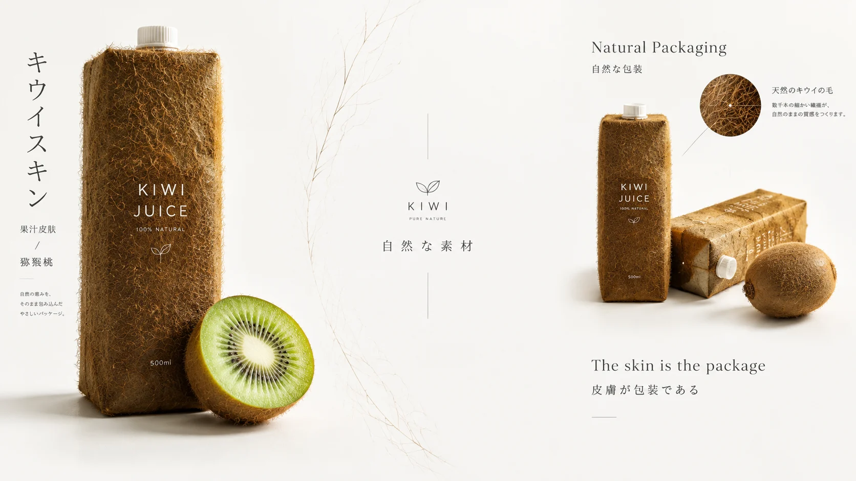
Camera Create a premium 16:9 landscape product-concept poster with an asymmetrically balanced three-zone layout: approximately 40% of the canvas on the left for the hero product, 3…
Model recorded for this example: gpt-image-2.5
Complete prompt
Camera Create a premium 16:9 landscape product-concept poster with an asymmetrically balanced three-zone layout: approximately 40% of the canvas on the left for the hero product, 30% of the center for generous breathing room, and 30% on the right for a product grouping and detail callouts. Combine frontal product photography with refined editorial graphic design. Keep the product sharply focused and gallery-ready. Scene A pure white setting inspired by Japanese wabi-sabi and minimalist lifestyle design. Use abundant negative space and a quiet, restrained layout. In the center, add only delicate thin lines and a very subtle, low-opacity kiwi-fuzz texture pattern that does not compete with the open space. Communicate natural materials and thoughtful packaging. Subject No people. On the left, show one upright rectangular kiwi-juice package wrapped entirely in the texture of real kiwi peel. Its brown surface has subtle natural color variation and thousands of clearly visible, fine brown hair-like fibers. The surface feels rough, organic, and convincingly real, as if actual kiwi skin were stretched over the package. Below it, place one freshly cut kiwi cross-section with vivid green creamy flesh and black seeds radiating outward from a white center. Action On the left, use soft dramatic lighting to reveal the upright package and the microscopic detail of its kiwi fuzz. Beside it, set the Japanese typography “キウイスキン” vertically in an elegant thin Gothic font, with “果汁皮膚 / 猕猴桃” and a small, concise Japanese design-philosophy note. Keep the center spacious and white, with a few delicate lines, a restrained minimalist brand mark, and the floating text “自然な素材”. On the right, arrange two kiwi-juice packages artistically at different heights and angles, alongside one whole kiwi with natural fuzzy brown skin. Add the typography “Natural Packaging / 自然な包装” and the tagline “The skin is the package / 皮膚が包装である”. Use fine callout lines to point to the authentic hair-like fibers on the package. Keep all text accurate, legible, understated, and generously spaced. Lighting / Color Use soft diffused studio lighting against a bright, clean white background, with natural highlights and delicate shadows on the package edges and fruit flesh. Limit the palette to brown kiwi-skin tones, pure white, and vivid green flesh. Macro-sharp detail should reveal the direction, density, and natural variation of thousands of fine brown fibers. Photorealistic, quiet, elegant Japanese product-editorial design. Negative Prompt Kiwi fuzz that looks plastic, rubbery, or like synthetic flocking; smooth surface; blurry or overly thick fibers; deformed package; incorrect kiwi flesh color; chaotic seed pattern; cluttered layout; insufficient negative space; unbalanced three-zone proportions; garbled or misspelled text; callouts pointing to the wrong detail; excessive decoration; heavy shadows; harsh reflections; oversaturation; cartoon; illustration; cheap CGI appearance; low resolution; blur; watermark; unrequested brand logos.
Results vary by model and settings. Keep the subject and composition, then adjust lighting, materials or background for your own project.
Use prompt